
The idea that websites should be designed in a “responsive” manner is part of the internet’s answer to the changing browsing trends that began many years ago with smartphones and tablets.
In other words, the way people access the internet has moved from 100% desktop devices to, now, predominantly hand-held devices.
In website design, what does the term responsive mean?
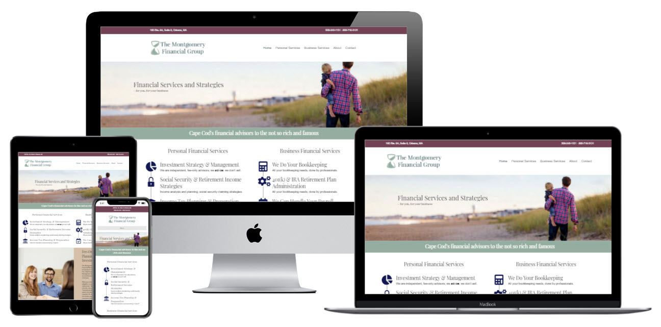
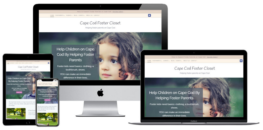
The term “responsive design” refers to a website that will remake itself depending on what size screen (i.e. desktop, tablet, or smartphone) is being used to view it
At first this may seem unnecessary, but when you consider all the possible combinations of browsers and devices accessing your website then this makes far more sense.
Responsive websites actually load faster than fixed-width websites because they adjust themselves accordingly and only load the amount of data required for each device.
What is a mobile-friendly website?
A mobile-friendly website has an interface that is optimized for use on a phone or other hand-held device. It will have a layout and text size that is readable and can work with any type of internet connection.
Responsive web design adjusts the layout and size of all of the various elements on a web page. What you see spread out across a large, full sized screen will not look good on a very small device. A mobile web design will rearrange and resize all of these different elements.
A seemingly simple example: you have to be careful to set the size of the text to be large enough to be easy to read on a phone.
Website developers also think about how quickly your web page will load. There are ways to build the website so that it will load quickly on a smart phone that may not have a fast connection.
Mobile Website Design - Since 2014
There are many reasons why your small business needs to invest in a mobile website design. Some of these reasons include:
A site that is not responsive will have trouble ranking in Google search results, and your business will suffer as a result. A responsive site can be viewed on any device, from laptops to smartphones, without having to rely on a separate app.
Mobile websites are not new. Way back in 2014, Google announced it’s initiative to promote mobile-friendly websites. In November 14, 2014, Google asked:
"Have you ever tapped on a Google Search result on your mobile phone, only to find yourself looking at a page where the text was too small, the links were tiny, and you had to scroll sideways to see all the content? This usually happens when the website has not been optimized to be viewed on a mobile phone."
Google started penalizing sites that were not mobile-friendly as early as 2015:
"Starting April 21, we will be expanding our use of mobile-friendliness as a ranking signal. This change will affect mobile searches in all languages worldwide and will have a significant impact in our search results. Consequently, users will find it easier to get relevant, high quality search results that are optimized for their devices."
It was known as “Mobilegeddon,” as Google began to reward websites with mobile designs.
This meant that web designers and business owners really needed to start paying attention to the “user experience” on mobile devices.
How does a responsive site help your business?
A responsive site is important for small business success because it allows your site to be seen on any device, such as a laptop or phone, without needing to load a separate app.
A responsive site will rank high in Google search results. A site that is not responsive will have trouble ranking in Google search results and will suffer as a result.
Imagine you have a business that depends on Google search results to bring in new customers. If your site is not responsive, it’s harder to find. This will be bad news for your business as the people who are looking for your products and services don’t have access to them.
"With mobile commerce sales expected to hit $2.92 trillion in 2020, ecommerce store owners can no longer afford to neglect the importance of having a mobile-optimized online store to attract customers and grow their business."
Online Shopping - Frequently Done on a Phone
Consumers often use their phones or tablets for shopping online, so if your audience uses primarily smartphones for browsing then you might be missing out on some serious sales by not having a mobile-friendly site.
What about the competition?
It’s important to design a mobile site that is responsive, in order to compete with your competition. If your site is not optimized specifically for mobile devices, but their site is, then you could miss out on a large chunk of traffic. It’s worth it to take the time and expense to create an efficient, responsive website.

Get our your phone and take a look at your competitor’s websites. Do they look better than yours?
Another benefit of a mobile-friendly website design is the ability to show well to all of your traffic, so you don’t lose sales opportunities.
This is especially true if you’re selling things online. People don’t have a lot of patience if they can’t find what they want!
The best way to attract new clients is by reaching them where they are the most active – on their phone or tablet! This means you need a site that can be accessed from anywhere, even when people don’t have their full desktop computer available to them.
How to know if your website is mobile-friendly or not
An easy way to tell if your site is mobile-friendly is to test it on a mobile device. If the site works correctly for you on your smartphone or tablet, then your site is mobile-friendly by definition.
You can also use the free Google testing tool. Head over to their Mobile-Friendly Test page. Enter the address of the webpage you want to test, and click the button.

Mobile websites create a seamless user experience across all platforms
A mobile website design can create a seamless user experience across all platforms.
Mobile users are very goal-oriented. They expect to be able to get what they need, immediately, and on their own terms.
“Seamless” means the user experiences no glitches… no delays, no bad links, no hunting for content. It’s easy for them to find and go to the content that interests them. It means that you don’t need to worry about users on any given device being unable to access your site.
You also won’t need to worry about being penalized in Google search results and watch your business suffer as a result. The last major advantage of having a mobile website is that it helps you make money.
Here’s a quick example, directly from Google. The good one, on the left, has clear and obvious buttons for navigation. On the right? Not so much.

Who should consider investing in responsive web design and why
Anyone with a small business that relies on customers to find them online should consider investing in responsive web design. You may rank higher when potential customers type your keywords into Google search and you can use less resources developing a site that will be viewed on any device.
In Conclusion
A mobile website design is important for small business success.
The best way to attract new clients is by reaching them where they are the most active – on their phone or tablet! This means you need a site that can be accessed from anywhere, even when people don’t have their full desktop computer available to them.
A responsive site can help your company rank higher in search engine results which will lead to increased revenue and better customer satisfaction rates.
If all of this sounds intimidating and you want to make sure your site is in good shape, let us know.
We’ll partner with you to create a mobile responsive website for your Cape Cod business. Draw more customers to your business with a website that looks great and is easy to use – on any device!


